ProductOnboarding checklist
Built by DesignMe, free to use under the MIT licence.
Expert design and dev support for startups and enterprises.
Book a callOnboarding checklist
First steps with a progress ring, and the agent can do some for you. Free and MIT licensed, as HTML or a typed React component, in two styles with light and dark mode.
Install
Add it to your project with the CLI.
HTML, CSS and JavaScript
npx designme add onboarding-checklistReact
npx designme add onboarding-checklist --reactThe CLI copies the source into your project, so you own it and can change anything. The HTML version lands in ./designme with the shared core and a demo.html. The React version lands in src/components/designme and needs React 19; it works in Next.js, Vite and Astro.
About
What it is for and what it does.
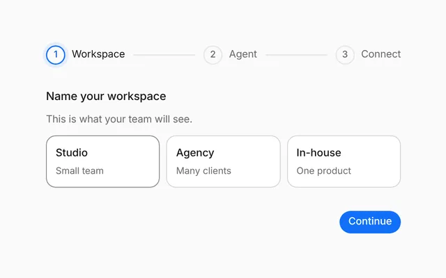
Onboarding checklist lists a new user's first steps with a progress ring that fills as they are ticked off. Steps the agent can handle carry a Do it for me button, and while the agent works the step shows a spinner and "The agent is on it". When every step is done, the ring shows a green check and a closing note appears.
- When new users need a few setup steps, such as connecting a tool or inviting a teammate
- When the agent can complete some setup steps on the person's behalf
- When onboarding sits in a chat thread or a sidebar and should fold away
- When you want progress to be visible at a glance
- The ring fills to the share of steps done, and the status line reads "2 of 5 done" until everything is done.
- Clicking a step's checkbox or anywhere on its row ticks it, and clicking again unticks it.
- Steps marked
automaticshow Do it for me on hover or focus; it callsonDoIt, and a returned promise shows the step running until it settles and then ticks it. - Keys in
runningshow a step as in progress even when the agent started it on its own. - The chevron folds the list away, and
opencan be controlled. bare(the default) sits flat in a chat thread; set it to false to give it its own card.
- The ring is an SVG with
role="progressbar"andaria-valuenow,aria-valueminandaria-valuemaxset to the step counts. - Each step's checkbox is a button with
role="checkbox",aria-checkedand the step title as its label. - The fold button has
aria-expanded, and the folded list isinertandaria-hidden. - Do it for me buttons become visible on keyboard focus as well as on hover.
Usage
Import it and drive it from your own state.
Import
import { OnboardingChecklist } from '@/components/designme/onboarding-checklist/OnboardingChecklist';Example
The demo above as a React component, 30 lines you can copy.
'use client';
// The animated preview from designme.dev, rebuilt from the React component: the agent connects Figma by itself, and the other
// "Do it for me" buttons take a moment before they tick their step off.
import { useRef, useState } from 'react';
import { OnboardingChecklist, type OnboardingStep } from './OnboardingChecklist';
import { useScript, useTakeover } from '../lib/useScript';

const STEPS: OnboardingStep[] = [
  { key: 'workspace', title: 'Create your workspace', detail: 'Done when you signed up', done: true },
  { key: 'figma', title: 'Connect Figma', detail: 'So the agent can read your frames', automatic: true },
  { key: 'tokens', title: 'Import your tokens', detail: 'Colours, type and spacing', automatic: true },
  { key: 'invite', title: 'Invite a teammate', detail: 'Design is better together' },
  { key: 'audit', title: 'Run your first audit', detail: 'Takes about a minute', automatic: true }
];

export default function OnboardingChecklistDemo() {
  const [done, setDone] = useState(['workspace']);
  const [running, setRunning] = useState<string[]>([]);
  // a moment after it appears, the agent starts on Figma, unless you take over first; once it has started, it finishes
  const ref = useRef<HTMLDivElement>(null), mine = useTakeover(ref);
  useScript(async ({ wait }) => {
    await wait(1300); if (mine()) return; setRunning(['figma']);
    await wait(1400); setRunning([]); setDone(d => (d.includes('figma') ? d : [...d, 'figma']));
  });
  return (
    <div ref={ref} style={{ display: 'contents' }}><OnboardingChecklist steps={STEPS} done={done} onDoneChange={setDone} running={running}
      onDoIt={() => new Promise(res => setTimeout(res, 1400))} /></div>
  );
}
Props
Everything OnboardingChecklist takes.
| Prop | Type | What it does |
|---|---|---|
stepsrequired | OnboardingStep[] | |
done | string[] | Keys of the steps that are done. Leave it out to let the checkboxes tick them |
defaultDone | string[] | |
onDoneChange | (done: string[]) => void | |
running | string[] | Keys of the steps the agent is doing right now: a spinner in the checkbox and `runningLabel` under the title |
onDoIt | (step: OnboardingStep, index: number) => void | Promise<unknown> | "Do it for me" was pressed. Return a promise and the step shows as running until it settles, then ticks itself off |
title | string | Like "Get set up" |
status | string | The line under the title. Defaults to "2 of 5 done", then "All done. Nice work" |
doneMessage | ReactNode | The note that comes in once every step is done |
doItLabel | string | |
runningLabel | string | |
open | boolean | Whether the list is open. Leave it out to let the chevron fold it away |
defaultOpen | boolean | |
onOpenChange | (open: boolean) => void | |
bare | boolean | Sits flat in a chat thread (the default, as on designme.dev). Set false to give it a card of its own |
className | string |
Code
The full source, as the CLI installs it.
OnboardingChecklist.tsxReact · 117 lines
'use client';
import { useEffect, useRef, useState, type ReactNode } from 'react';
import { cx } from '../lib/cx';
import { useControllable } from '../lib/hooks';
import { Icon } from '../lib/icons';
import { enter, Fold, Swap, Tip } from '../lib/motion';
import '../designme.css';
import './onboarding-checklist.css';

export interface OnboardingStep {
  /** Names the step in `done` and `running`. Defaults to the title */
  key?: string;
  /** Like "Connect Figma" */
  title: string;
  /** The quiet line under it, like "So the agent can read your frames" */
  detail?: string;
  /** Ticked off when the checklist starts, if `done` and `defaultDone` are left out */
  done?: boolean;
  /** Shows a "Do it for me" button on hover, which calls `onDoIt` */
  automatic?: boolean;
}

export interface OnboardingChecklistProps {
  steps: OnboardingStep[];
  /** Keys of the steps that are done. Leave it out to let the checkboxes tick them */
  done?: string[];
  defaultDone?: string[];
  onDoneChange?: (done: string[]) => void;
  /** Keys of the steps the agent is doing right now: a spinner in the checkbox and `runningLabel` under the title */
  running?: string[];
  /** "Do it for me" was pressed. Return a promise and the step shows as running until it settles, then ticks itself off */
  onDoIt?: (step: OnboardingStep, index: number) => void | Promise<unknown>;
  /** Like "Get set up" */
  title?: string;
  /** The line under the title. Defaults to "2 of 5 done", then "All done. Nice work" */
  status?: string;
  /** The note that comes in once every step is done */
  doneMessage?: ReactNode;
  doItLabel?: string;
  runningLabel?: string;
  /** Whether the list is open. Leave it out to let the chevron fold it away */
  open?: boolean;
  defaultOpen?: boolean;
  onOpenChange?: (open: boolean) => void;
  /** Sits flat in a chat thread (the default, as on designme.dev). Set false to give it a card of its own */
  bare?: boolean;
  className?: string;
}

const RING = 100.5;
const keyOf = (s: OnboardingStep) => s.key ?? s.title;

/** A few first steps with a progress ring. The agent can do some of them for the person. */
export function OnboardingChecklist({ steps, done, defaultDone, onDoneChange, running, onDoIt, title = 'Get set up', status,
  doneMessage = 'You are all set. The agent will suggest what to try next.', doItLabel = 'Do it for me', runningLabel = 'The agent is on it',
  open, defaultOpen = true, onOpenChange, bare = true, className }: OnboardingChecklistProps) {
  const [ticked, setTicked] = useControllable(done, defaultDone ?? steps.filter(s => s.done).map(keyOf), onDoneChange);
  const [isOpen, setOpen] = useControllable(open, defaultOpen, onOpenChange);
  // steps started from "Do it for me" that are still waiting on onDoIt
  const [pending, setPending] = useState<string[]>([]);
  const latest = useRef(ticked);
  useEffect(() => { latest.current = ticked; });
  // the ring fills in a moment after the checklist appears
  const [ready, setReady] = useState(false);
  useEffect(() => { const t = setTimeout(() => setReady(true), 200); return () => clearTimeout(t); }, []);

  const n = steps.filter(s => ticked.includes(keyOf(s))).length, all = n === steps.length && n > 0;
  const toggle = (k: string) => setTicked(ticked.includes(k) ? ticked.filter(x => x !== k) : [...ticked, k]);
  const doIt = (s: OnboardingStep, i: number) => {
    const k = keyOf(s), out = onDoIt?.(s, i);
    if (!out || typeof (out as Promise<unknown>).then !== 'function') return;
    setPending(p => [...p, k]);
    (out as Promise<unknown>).then(
      () => { setPending(p => p.filter(x => x !== k)); if (!latest.current.includes(k)) setTicked([...latest.current, k]); },
      () => setPending(p => p.filter(x => x !== k)));
  };

  return (
    <div data-dm="" className={cx('dm-obx', !bare && 'dm-panel', className)}>
      <div className="dm-obx-h">
        {/* when every step is done, a green check grows in the middle of the ring */}
        <span className={cx('dm-obx-rw', ready && all && 'dm-full')}>
          <svg className={cx('dm-obx-ring', ready && all && 'dm-full')} viewBox="0 0 40 40" role="progressbar" aria-label={title} aria-valuemin={0} aria-valuemax={steps.length} aria-valuenow={n}>
            <circle cx="20" cy="20" r="16" className="dm-tr" />
            <circle cx="20" cy="20" r="16" className="dm-fl" style={{ strokeDashoffset: ready ? RING * (1 - n / steps.length) : RING }} />
          </svg>
          <span className="dm-obx-rk" aria-hidden="true"><Icon name="check" size="xs" /></span>
        </span>
        <div className="dm-obx-ht"><b>{title}</b><Swap className="dm-muted dm-obx-st">{status ?? (all ? 'All done. Nice work' : `${n} of ${steps.length} done`)}</Swap></div>
        <Tip label={isOpen ? 'Collapse' : 'Expand'}>
          <button type="button" className={cx('dm-ib dm-obx-min', !isOpen && 'dm-shut')} aria-label={isOpen ? 'Collapse' : 'Expand'} aria-expanded={isOpen} onClick={() => setOpen(!isOpen)}><Icon name="chev-d" size="xs" /></button>
        </Tip>
      </div>
      <Fold open={isOpen} className="dm-obx-fold">
        <div className="dm-obx-list">
          {steps.map((s, i) => {
            const k = keyOf(s), isDone = ticked.includes(k), run = !isDone && (pending.includes(k) || !!running?.includes(k));
            const e = enter(i * 50);
            return (
              // the whole row ticks the step, not only its checkbox; its button does its own thing, and a running step waits
              <div key={k} className={cx('dm-obx-s', isDone && 'dm-done', run && 'dm-run', e.className)} style={e.style}
                onClick={ev => { if (!run && !(ev.target as HTMLElement).closest('.dm-obx-ck, .dm-pill')) toggle(k); }}>
                <button type="button" className="dm-obx-ck" role="checkbox" aria-checked={isDone} aria-label={s.title} onClick={() => toggle(k)}>
                  {run ? <span className="dm-spin" style={{ width: 14, height: 14 }} /> : <Icon name="check" size="xs" />}
                </button>
                <span className="dm-t"><b>{s.title}</b>{s.detail !== undefined && <Swap className={run ? 'dm-shim' : undefined}>{run ? runningLabel : s.detail}</Swap>}</span>
                {s.automatic && <button type="button" className="dm-pill dm-soft dm-sm" onClick={() => doIt(s, i)}><Icon name="spark" size="xs" />{doItLabel}</button>}
              </div>
            );
          })}
          {all && <div key="dn" className="dm-obx-dn dm-enter"><Icon name="ok" size="xs" />{doneMessage}</div>}
        </div>
      </Fold>
    </div>
  );
}
onboarding-checklist.cssReact · 44 lines
/* Generated from designme.dev by scripts/sync.mjs. Edit the site, then sync. */
/* ---------- Onboarding checklist ---------- */
/* posted in the chat: no container of its own; with .panel it becomes a card */
.dm-obx{padding:var(--dm-s-3) 0;display:flex;flex-direction:column;gap:6px}
.dm-obx.dm-panel{padding:var(--dm-s-3)}
.dm-obx-h{display:flex;align-items:center;gap:var(--dm-s-3);padding:2px 0}
.dm-obx-rw{position:relative;width:38px;height:38px;flex:none}
.dm-obx-ring{width:38px;height:38px;transform:rotate(-90deg);display:block}
/* everything done: a green check grows in the middle of the ring */
.dm-obx-rk{position:absolute;inset:7px;border-radius:50%;background:var(--dm-accent);color:var(--dm-on-accent);display:grid;place-items:center;opacity:0;transform:scale(.4);transition:opacity .35s var(--dm-ease),transform .55s var(--dm-ease)}
.dm-obx-rw.dm-full .dm-obx-rk{opacity:1;transform:none}
/* round in Blueprint too: it sits inside the round ring */
.dm-obx .dm-obx-rw .dm-obx-rk{border-radius:50%!important}
.dm-obx-ring circle{fill:none;stroke-width:3.5;stroke-linecap:round}
.dm-obx-ring .dm-tr{stroke:var(--dm-line)}
.dm-obx-ring .dm-fl{stroke:var(--dm-accent-mark,var(--dm-accent));stroke-dasharray:100.5;stroke-dashoffset:100.5;transition:stroke-dashoffset .8s var(--dm-ease),stroke .4s}
.dm-obx-ring.dm-full .dm-fl{stroke:var(--dm-accent-mark,var(--dm-accent))}
.dm-obx-ht{flex:1;display:flex;flex-direction:column;font-size:14px}
.dm-obx-ht b{font-weight:500}
.dm-obx-st{font-size:12px}
.dm-obx-min svg{transition:transform .4s var(--dm-ease)}
.dm-obx-min.dm-shut svg{transform:rotate(-90deg)}
/* each checkbox sits under the middle of the ring, and the titles line up with the heading */
.dm-obx-list{display:flex;flex-direction:column;padding-top:var(--dm-s-1)}
.dm-obx-s{display:flex;align-items:center;gap:21px;padding:var(--dm-s-2) var(--dm-s-2) var(--dm-s-2) 9px;border-radius:10px;font-size:13px;cursor:pointer;transition:background .2s}
.dm-obx-s.dm-run{cursor:default}
@media (hover:hover) and (pointer:fine){.dm-obx-s:hover{background:var(--dm-row)}}
/* an open step's box is a dimmed grey ring, never a dark one; it still holds 3:1 */
.dm-obx-ck{width:20px;height:20px;border-radius:50%;box-shadow:inset 0 0 0 1px color-mix(in srgb,var(--dm-pick-on) 50%,transparent);display:grid;place-items:center;color:transparent;flex:none;transition:background .3s var(--dm-ease),box-shadow .3s,color .3s}
.dm-obx-ck svg{transform:scale(.4);transition:transform .4s var(--dm-ease)}
.dm-obx-s.dm-done .dm-obx-ck{background:var(--dm-accent);box-shadow:none;color:var(--dm-on-accent)}
.dm-obx-s.dm-done .dm-obx-ck svg{transform:none}
.dm-obx-s.dm-run .dm-obx-ck{box-shadow:none;color:var(--dm-accent-fg,var(--dm-accent))}
.dm-obx-s .dm-t{flex:1;display:flex;flex-direction:column;min-width:0}
.dm-obx-s .dm-t span{font-size:12px;color:var(--dm-muted)}
.dm-obx-s.dm-done .dm-t>b{color:var(--dm-muted);text-decoration:line-through;text-decoration-color:var(--dm-faint)}
.dm-obx-s .dm-t>b{font-weight:400;transition:color .3s}
.dm-obx-s .dm-pill{opacity:0;transition:opacity .2s}
.dm-obx-s .dm-pill:focus-visible{opacity:1}
@media (hover:hover) and (pointer:fine){.dm-obx-s:hover .dm-pill{opacity:1}}
.dm-obx-s.dm-done .dm-pill,.dm-obx-s.dm-run .dm-pill{display:none}
.dm-obx-dn{display:flex;align-items:center;gap:var(--dm-s-2);padding:10px;border-radius:var(--dm-r-in);background:var(--dm-accent-bg);color:var(--dm-fg);font-size:13px;margin-top:var(--dm-s-1)}
.dm-obx-dn svg{color:var(--dm-accent-fg,var(--dm-accent));flex:none}
onboarding-checklist.htmlHTML · 9 lines
<div class="card bare" data-c="onboarding-checklist">
  <div class="stage-in">
    <div class="obx">
      <div class="obx-h"><span class="obx-rw"><svg class="obx-ring" viewBox="0 0 40 40"><circle cx="20" cy="20" r="16" class="tr"/><circle cx="20" cy="20" r="16" class="fl"/></svg><span class="obx-rk"><svg class="i xs"><use href="#i-check"/></svg></span></span><div class="obx-ht"><b>Get set up</b><span class="muted obx-st">0 of 5 done</span></div><button class="ib obx-min" aria-label="Collapse" data-tip="Collapse"><svg class="i xs"><use href="#i-chev-d"/></svg></button></div>
      <div class="fold obx-fold"><div><div class="obx-list"></div></div></div>
    </div>
  </div>
</div>
onboarding-checklist.cssHTML · 43 lines
/* ---------- Onboarding checklist ---------- */
/* posted in the chat: no container of its own; with .panel it becomes a card */
.obx{padding:var(--s-3) 0;display:flex;flex-direction:column;gap:6px}
.obx.panel{padding:var(--s-3)}
.obx-h{display:flex;align-items:center;gap:var(--s-3);padding:2px 0}
.obx-rw{position:relative;width:38px;height:38px;flex:none}
.obx-ring{width:38px;height:38px;transform:rotate(-90deg);display:block}
/* everything done: a green check grows in the middle of the ring */
.obx-rk{position:absolute;inset:7px;border-radius:50%;background:var(--accent);color:var(--on-accent);display:grid;place-items:center;opacity:0;transform:scale(.4);transition:opacity .35s var(--ease),transform .55s var(--ease)}
.obx-rw.full .obx-rk{opacity:1;transform:none}
/* round in Blueprint too: it sits inside the round ring */
.obx .obx-rw .obx-rk{border-radius:50%!important}
.obx-ring circle{fill:none;stroke-width:3.5;stroke-linecap:round}
.obx-ring .tr{stroke:var(--line)}
.obx-ring .fl{stroke:var(--accent-mark,var(--accent));stroke-dasharray:100.5;stroke-dashoffset:100.5;transition:stroke-dashoffset .8s var(--ease),stroke .4s}
.obx-ring.full .fl{stroke:var(--accent-mark,var(--accent))}
.obx-ht{flex:1;display:flex;flex-direction:column;font-size:14px}
.obx-ht b{font-weight:500}
.obx-st{font-size:12px}
.obx-min svg{transition:transform .4s var(--ease)}
.obx-min.shut svg{transform:rotate(-90deg)}
/* each checkbox sits under the middle of the ring, and the titles line up with the heading */
.obx-list{display:flex;flex-direction:column;padding-top:var(--s-1)}
.obx-s{display:flex;align-items:center;gap:21px;padding:var(--s-2) var(--s-2) var(--s-2) 9px;border-radius:10px;font-size:13px;cursor:pointer;transition:background .2s}
.obx-s.run{cursor:default}
@media (hover:hover) and (pointer:fine){.obx-s:hover{background:var(--row)}}
/* an open step's box is a dimmed grey ring, never a dark one; it still holds 3:1 */
.obx-ck{width:20px;height:20px;border-radius:50%;box-shadow:inset 0 0 0 1px color-mix(in srgb,var(--pick-on) 50%,transparent);display:grid;place-items:center;color:transparent;flex:none;transition:background .3s var(--ease),box-shadow .3s,color .3s}
.obx-ck svg{transform:scale(.4);transition:transform .4s var(--ease)}
.obx-s.done .obx-ck{background:var(--accent);box-shadow:none;color:var(--on-accent)}
.obx-s.done .obx-ck svg{transform:none}
.obx-s.run .obx-ck{box-shadow:none;color:var(--accent-fg,var(--accent))}
.obx-s .t{flex:1;display:flex;flex-direction:column;min-width:0}
.obx-s .t span{font-size:12px;color:var(--muted)}
.obx-s.done .t>b{color:var(--muted);text-decoration:line-through;text-decoration-color:var(--faint)}
.obx-s .t>b{font-weight:400;transition:color .3s}
.obx-s .pill{opacity:0;transition:opacity .2s}
.obx-s .pill:focus-visible{opacity:1}
@media (hover:hover) and (pointer:fine){.obx-s:hover .pill{opacity:1}}
.obx-s.done .pill,.obx-s.run .pill{display:none}
.obx-dn{display:flex;align-items:center;gap:var(--s-2);padding:10px;border-radius:var(--r-in);background:var(--accent-bg);color:var(--fg);font-size:13px;margin-top:var(--s-1)}
.obx-dn svg{color:var(--accent-fg,var(--accent));flex:none}
onboarding-checklist.jsHTML · 22 lines
DM.def('onboarding-checklist', (r, c) => {
  r.innerHTML = r.innerHTML.replace('{chev}', I('chev-d','xs')).replace('{check}', I('check','xs'));
  const S = [['Create your workspace','Done when you signed up',1,0],['Connect Figma','So the agent can read your frames',0,1],['Import your tokens','Colours, type and spacing',0,1],['Invite a teammate','Design is better together',0,0],['Run your first audit','Takes about a minute',0,1]];
  const list = $('.obx-list', r), st = $('.obx-st', r), ring = $('.obx-ring', r), rw = $('.obx-rw', r), fl = $('.obx-ring .fl', r);
  list.innerHTML = S.map((s, i) => `<div class="obx-s${s[2] ? ' done' : ''}" data-i="${i}"><button class="obx-ck" role="checkbox" aria-checked="${!!s[2]}" aria-label="${s[0]}">${I('check','xs')}</button><span class="t"><b>${s[0]}</b><span>${s[1]}</span></span>${s[3] ? `<button class="pill soft sm">${I('spark','xs')}Do it for me</button>` : ''}</div>`).join('');
  const rows = $$('.obx-s', list);
  function tally(){ const n = S.filter(s => s[2]).length; fl.style.strokeDashoffset = 100.5 * (1 - n / S.length); ring.classList.toggle('full', n === S.length); rw.classList.toggle('full', n === S.length); swap(st, n === S.length ? 'All done. Nice work' : n + ' of ' + S.length + ' done');
    if (n === S.length && !$('.obx-dn', list)){ const d = html(`<div class="obx-dn">${I('ok','xs')}You are all set. The agent will suggest what to try next.</div>`); list.appendChild(d); enter(d); } else if (n < S.length) $('.obx-dn', list)?.remove(); }
  const set = (i, v) => { S[i][2] = v; rows[i].classList.toggle('done', v); $('.obx-ck', rows[i]).setAttribute('aria-checked', v); tally(); };
  rows.forEach((row, i) => {
    $('.obx-ck', row).onclick = () => set(i, !S[i][2]);
    // the whole row ticks the step, not only its checkbox (its button does its own thing, and a running step waits)
    row.onclick = e => { if (e.target.closest('.obx-ck, .pill') || row.classList.contains('run')) return; set(i, !S[i][2]); };
    const p = $('.pill', row); if (p) p.onclick = () => c.run(async () => { row.classList.add('run'); const ck = $('.obx-ck', row); ck.innerHTML = '<span class="spin" style="width:14px;height:14px"></span>'; const sp = $('.t span', row), was = sp.textContent; swap(sp, 'The agent is on it'); sp.classList.add('shim');
      await c.wait(1400); ck.innerHTML = I('check','xs'); row.classList.remove('run'); sp.classList.remove('shim'); swap(sp, was); set(i, 1); });
  });
  const mn = $('.obx-min', r); mn.onclick = () => { const s = $('.obx-fold', r).classList.toggle('shut'); mn.classList.toggle('shut', s); mn.dataset.tip = s ? 'Expand' : 'Collapse'; };
  stagger(rows, 50); c.later(200, tally);
  // the preview has the agent connect Figma once on its own, unless you take over first
  c.auto(1300, () => $('.pill', rows[1]).click());
});
Questions
What people ask about it.
- How do I let the agent complete a step?
- Mark the step
automaticand handleonDoIt. Return a promise: the step shows "The agent is on it" until it resolves, then ticks itself off. If it rejects, the step goes back to waiting. - Can the agent start a step without the person pressing anything?
- Yes. Put the step's key in
runningwhile the agent works, then add the key todone. The example does this for Connect Figma. - How do I keep progress between sessions?
- Control it with
doneandonDoneChange, which gives you the list of ticked step keys to save and pass back next time.
More in Product
Pricing, onboarding, setup flows and spending limits for the rest of your product.