DatesSegmented control
Built by DesignMe, free to use under the MIT licence.
Expert design and dev support for startups and enterprises.
Book a callSegmented control
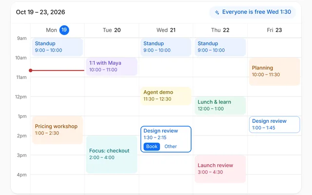
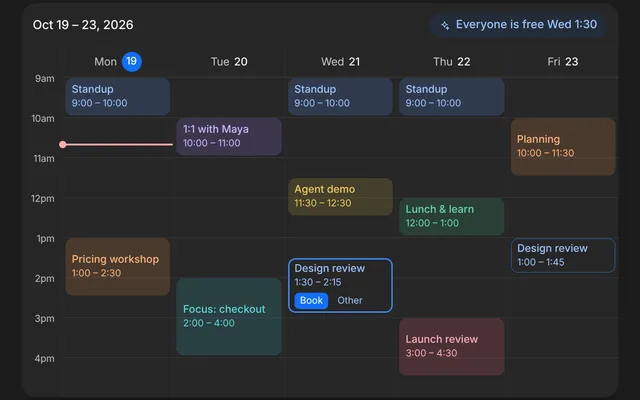
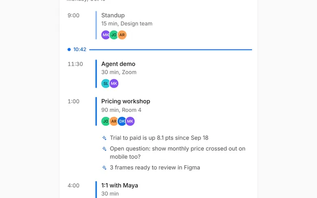
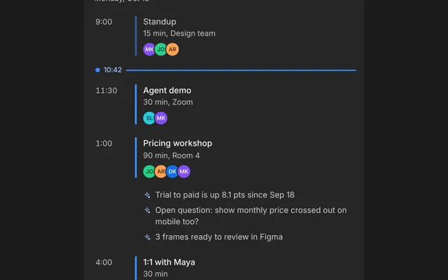
Switch between views of the same thing, with a sliding indicator. Free and MIT licensed, as HTML or a typed React component, in two styles with light and dark mode.
Install
Add it to your project with the CLI.
HTML, CSS and JavaScript
npx designme add segmented-controlReact
npx designme add segmented-control --reactThe CLI copies the source into your project, so you own it and can change anything. The HTML version lands in ./designme with the shared core and a demo.html. The React version lands in src/components/designme and needs React 19; it works in Next.js, Vite and Astro.
About
What it is for and what it does.
Segmented control is a row of two to five choices where exactly one is picked, shown as a raised knob that slides to it. Use it to switch between views of the same thing, like a day, a week and a month, or to set one option from a few. It sits inline next to a title and changes what's below it at once.
- When people switch between a few views of the same content, like Day, Week and Month.
- When there are two to five short options and all of them should stay visible.
- When the change should happen at once, without a separate Apply.
- Not for more than five options, or long labels: use a select or tabs with an overflow then.
optionsare the choices, each with avalueand alabel. The picked one sits on a raised knob that slides and resizes to it.value,defaultValueandonValueChangehold the pick.as="tabs"(the default) makes it a tab list for switching a panel;as="radio"makes it a radio group for setting an option.idties the tabs to their panel: the panel takesid="<id>-panel"andaria-labelledby="<id>-<value>".- The demo switches the pricing launch between a day of events, a working week with each weekday's first event and a count of the rest, and a month with a dot on each busy day. Previous and next step a day, a week or a month at a time, Today comes back to the current date, and a day in the week or the month opens it in the day view. The range above the panel crossfades as it changes.
- As tabs it is a
tablistnamed bylabel, each option atabwitharia-selectedandaria-controls, and the panel atabpanellabelled by the picked tab. - As a radio group it is a
radiogroupwithradiooptions andaria-checked. - Only the picked option is in the tab order. ← and → move and pick, wrapping at the ends, and Home and End jump to the first and last.
- The knob is decoration; the picked option's state says the same.
- In the demo, previous and next are named for the view, like Previous week, and each day in the week and the month is a button named with its date and how many events it has.
Usage
Import it and drive it from your own state.
Import
import { SegmentedControl } from '@/components/designme/segmented-control/SegmentedControl';Example
The demo above as a React component, 138 lines you can copy.
'use client';
// The animated preview from designme.dev, rebuilt from the React component: an example of driving it from your own state.
import { useEffect, useRef, useState, type CSSProperties } from 'react';
import { SegmentedControl } from './SegmentedControl';
import { cx } from '../lib/cx';
import { Icon } from '../lib/icons';
import { Swap } from '../lib/motion';
import { useStory } from '../lib/useScript';

/* ---------- Segmented control: the pricing launch as a day, a week or a month, stepped through and opened a day at a time ---------- */
type View = 'day' | 'week' | 'month';
type Ev = [time: string, title: string, detail: string, color: string];
// the pricing launch in October 2026. Today is Friday the 23rd
const TODAY = new Date(2026, 9, 23, 12), DAY = 864e5;
const at = (d: Date, n: number) => new Date(d.getFullYear(), d.getMonth(), d.getDate() + n, 12);
const iso = (d: Date) => d.toISOString().slice(0, 10);
const same = (a: Date, b: Date) => iso(a) === iso(b);
const fmt = (d: Date, o: Intl.DateTimeFormatOptions) => d.toLocaleDateString('en-US', o);
const mon = (d: Date) => at(d, -((d.getDay() + 6) % 7));
// launch week is written out; the days around it are drawn from the work that leads up to it and follows it
const E: Record<string, Ev[]> = {
  '2026-10-19': [['10:00', 'Kickoff with Maya', 'Pricing v4 brief', 'var(--dm-pl)'], ['15:00', 'Brief the agents', 'Build and copy agents', 'var(--dm-pm)']],
  '2026-10-20': [['10:00', 'Wireframe review', 'Pricing v4, frames 1 to 6', 'var(--dm-pl)'], ['11:30', 'Copy for the plan cards', 'Copy agent', 'var(--dm-pt)'], ['14:00', 'Token audit', 'Build agent', 'var(--dm-pm)']],
  '2026-10-21': [['11:00', 'Copy pass', 'Plan cards and FAQ', 'var(--dm-pt)']],
  '2026-10-22': [['14:00', 'Design QA', 'Pricing v4, all frames', 'var(--dm-pb)'], ['16:30', 'Fix contrast issues', 'Build agent', 'var(--dm-pm)']],
  '2026-10-23': [['09:30', 'Pricing review with Maya', 'Pricing v4, frames 1 to 3', 'var(--dm-pl)'], ['13:00', 'Export tokens to CSS', 'Build agent', 'var(--dm-pm)'], ['16:00', 'Ship pricing v4', 'designme.studio/pricing', 'var(--dm-pb)']],
  '2026-10-24': [], '2026-10-25': []
};
const POOL = [['Design crit', 'Pricing frames', 'var(--dm-pl)'], ['Token audit', 'Build agent', 'var(--dm-pm)'], ['Copy pass', 'Plan cards', 'var(--dm-pt)'], ['Stakeholder check-in', 'Weekly', 'var(--dm-pb)'],
  ['User interviews', 'Three sessions', 'var(--dm-pl)'], ['Conversion review', 'Trial to paid', 'var(--dm-pb)'], ['Research synthesis', 'Notes and quotes', 'var(--dm-pt)'], ['Fix review notes', 'Build agent', 'var(--dm-pm)']];
const TIMES = ['09:30', '10:00', '11:30', '13:00', '14:00', '15:30', '16:00'];
function events(d: Date): Ev[] {
  const k = iso(d); if (E[k]) return E[k];
  if (d.getDay() === 0 || d.getDay() === 6) return (E[k] = []);
  let h = Math.floor(+d / DAY) * 2654435761 >>> 0; const nx = (m: number) => { h = Math.imul(h ^ h >>> 15, 2246822519) >>> 0; return h % m; };
  const n = [0, 1, 1, 2, 2, 3][nx(6)], t = new Set<string>();
  while (t.size < n) t.add(TIMES[nx(TIMES.length)]);
  return (E[k] = [...t].sort().map(tm => { const e = POOL[nx(POOL.length)]; return [tm, e[0], e[1], e[2]] as Ev; }));
}
const label = (d: Date, n: number) => `${fmt(d, { weekday: 'long', month: 'long', day: 'numeric' })}, ${n ? n + (n === 1 ? ' event' : ' events') : 'nothing planned'}`;
const RANGE: Record<View, (d: Date) => string> = {
  day: d => fmt(d, { weekday: 'long', month: 'short', day: 'numeric' }),
  week: d => { const a = mon(d), b = at(a, 4); return fmt(a, { month: 'short', day: 'numeric' }) + ' – ' + (a.getMonth() === b.getMonth() ? b.getDate() : fmt(b, { month: 'short', day: 'numeric' })); },
  month: d => fmt(d, { month: 'long', year: 'numeric' })
};

// a day in the week or the month opens that day
function Panel({ view, date, open }: { view: View; date: Date; open: (d: Date) => void }) {
  if (view === 'day') {
    const ev = events(date);
    return ev.length ? (
      <div className="dm-sgc-day">
        {ev.map(([t, n, d, c]) => <div key={t} className="dm-sgc-ev" style={{ '--dm-c': c } as CSSProperties}><span className="dm-num dm-muted">{t}</span><i /><span className="dm-t">{n}<span>{d}</span></span></div>)}
      </div>
    ) : <div className="dm-sgc-none">Nothing planned</div>;
  }
  if (view === 'week') return (
    <div className="dm-sgc-wk">
      {Array.from({ length: 5 }, (_, i) => at(mon(date), i)).map(d => {
        const ev = events(d);
        return (
          <button key={iso(d)} type="button" aria-label={label(d, ev.length)} onClick={() => open(d)}
            className={['dm-sgc-wr', same(d, TODAY) && 'dm-now', !ev.length && 'dm-none'].filter(Boolean).join(' ')}>
            <span className="dm-d">{fmt(d, { weekday: 'short' })} {d.getDate()}</span>
            {ev.length
              ? <><span className="dm-e" style={{ '--dm-c': ev[0][3] } as CSSProperties}><i /><span>{ev[0][1]}</span></span>{ev.length > 1 && <span className="dm-more">+{ev.length - 1} more</span>}</>
              : <span className="dm-e">Nothing planned</span>}
          </button>
        );
      })}
    </div>
  );
  const first = new Date(date.getFullYear(), date.getMonth(), 1, 12), lead = (first.getDay() + 6) % 7, len = new Date(date.getFullYear(), date.getMonth() + 1, 0).getDate();
  return (
    <div className={['dm-sgc-mo', lead + len > 35 && 'dm-r6'].filter(Boolean).join(' ')}>
      {['M', 'T', 'W', 'T', 'F', 'S', 'S'].map((w, i) => <span key={'w' + i} className="dm-w" aria-hidden="true">{w}</span>)}
      {Array.from({ length: lead }, (_, i) => <span key={'b' + i} />)}
      {Array.from({ length: len }, (_, i) => {
        const d = at(first, i), n = events(d).length;
        return <button key={i} type="button" aria-label={label(d, n)} onClick={() => open(d)}
          className={['dm-d', 'dm-num', n && 'dm-e', same(d, TODAY) && 'dm-now', same(d, date) && !same(d, TODAY) && 'dm-on'].filter(Boolean).join(' ')}>{i + 1}</button>;
      })}
    </div>
  );
}

export default function SegmentedControlDemo() {
  const ref = useRef<HTMLDivElement>(null);
  const [view, setView] = useState<View>('day');
  const [date, setDate] = useState(TODAY);
  // the panel on show, and the one it replaced while that fades out under the new one, so no frame is empty
  const key = view + iso(date);
  const [layers, setLayers] = useState([{ key, view, date, gone: false }]);
  if (layers[layers.length - 1].key !== key) setLayers([...layers.filter(l => !l.gone).slice(-1).map(l => ({ ...l, gone: true })), { key, view, date, gone: false }]);
  useEffect(() => {
    if (!layers.some(l => l.gone)) return;
    const t = setTimeout(() => setLayers(ls => ls.filter(l => !l.gone)), 260);
    return () => clearTimeout(t);
  }, [layers]);
  // previous and next step by the view's unit; Today comes back to the 23rd
  const step = (k: number) => setDate(d => view === 'day' ? at(d, k) : view === 'week' ? at(d, 7 * k) : new Date(d.getFullYear(), d.getMonth() + k, 1, 12));
  const open = (d: Date) => { setDate(d); setView('day'); };

  // the preview's story: the week, then Tuesday opened from it, a step on to Wednesday, the month, and back to the week
  useStory(ref, async ({ wait, press }) => {
    await wait(1500); press('[data-v="week"]');
    await wait(2000); press('.dm-sgc-wr:nth-child(2)');
    await wait(2000); press('.dm-sgc-nx');
    await wait(1500); press('[data-v="month"]');
    await wait(2000); press('[data-v="week"]');
  });

  return (
    <div ref={ref} style={{ width: '100%' }}>
      <div data-dm="" className="dm-sgc dm-panel">
        <div className="dm-sgc-h">
          <div className="dm-sgc-ht"><b>Pricing launch</b></div>
          <SegmentedControl id="launch-view" label="View" value={view} onValueChange={setView}
            options={[{ value: 'day', label: 'Day' }, { value: 'week', label: 'Week' }, { value: 'month', label: 'Month' }]} />
        </div>
        <div className="dm-sgc-bar">
          <span className="dm-sgc-r" aria-live="polite"><Swap>{RANGE[view](date)}</Swap></span>
          <button type="button" className="dm-pill dm-ghost dm-sm dm-sgc-td" onClick={() => setDate(TODAY)}>Today</button>
          <button type="button" className="dm-ib dm-sgc-pv" aria-label={'Previous ' + view} onClick={() => step(-1)}><Icon name="chev-l" size="xs" /></button>
          <button type="button" className="dm-ib dm-sgc-nx" aria-label={'Next ' + view} onClick={() => step(1)}><Icon name="chev-r" size="xs" /></button>
        </div>
        <div className="dm-sgc-p" id="launch-view-panel" role="tabpanel" aria-labelledby={`launch-view-${view}`} tabIndex={0}>
          {layers.map((l, i) => (
            <div key={l.key} className={cx('dm-sgc-in', l.gone ? 'dm-gone' : i > 0 && 'dm-fresh')} inert={l.gone} aria-hidden={l.gone || undefined}>
              <Panel view={l.view} date={l.date} open={open} />
            </div>
          ))}
        </div>
      </div>
    </div>
  );
}
Props
Everything SegmentedControl takes.
| Prop | Type | What it does |
|---|---|---|
optionsrequired | SegmentOption<T>[] | |
value | T | |
defaultValue | T | |
onValueChange | (value: T) => void | |
labelrequired | string | Names the group for screen readers, like "View" |
as | 'tabs' | 'radio' | `tabs` (the default) when it switches a panel, `radio` when it sets an option |
id | string | Ties the tabs to their panel: put `id={`${id}-panel`}` and `aria-labelledby={`${id}-${value}`}` on the panel. Defaults to a generated id |
className | string |
Also takes the props of string = string>.
Code
The full source, as the CLI installs it.
SegmentedControl.tsxReact · 76 lines
'use client';
import { useId, useRef, useState, type CSSProperties, type KeyboardEvent, type ReactNode } from 'react';
import { cx } from '../lib/cx';
import { useControllable, useIsoLayoutEffect } from '../lib/hooks';
import '../designme.css';
import './segmented-control.css';

export interface SegmentOption<T extends string = string> {
  value: T;
  label: ReactNode;
}

export interface SegmentedControlProps<T extends string = string> {
  options: SegmentOption<T>[];
  value?: T;
  defaultValue?: T;
  onValueChange?: (value: T) => void;
  /** Names the group for screen readers, like "View" */
  label: string;
  /** `tabs` (the default) when it switches a panel, `radio` when it sets an option */
  as?: 'tabs' | 'radio';
  /** Ties the tabs to their panel: put `id={`${id}-panel`}` and `aria-labelledby={`${id}-${value}`}` on the panel. Defaults to a generated id */
  id?: string;
  className?: string;
}

/** One choice from a few views or options, with a white knob that slides to the picked one. As tabs, the arrow keys
    move along and pick, and Home and End jump to the ends; as a radio group, the arrow keys do the same. */
export function SegmentedControl<T extends string = string>({ options, value, defaultValue, onValueChange, label, as = 'tabs', id, className }: SegmentedControlProps<T>) {
  const auto = useId();
  const base = id ?? 'dm-sgc' + auto.replace(/:/g, '');
  const [cur, setCur] = useControllable(value, (defaultValue ?? options[0]?.value) as T, onValueChange);
  const ref = useRef<HTMLDivElement>(null);
  const [knob, setKnob] = useState<CSSProperties>({ transition: 'none' });
  const first = useRef(true);
  // the knob takes the picked button's place and width, without sliding in on the first paint
  useIsoLayoutEffect(() => {
    const el = ref.current; if (!el) return;
    const place = () => {
      const b = el.querySelector<HTMLElement>('[data-on="true"]'); if (!b) return;
      setKnob({ left: b.offsetLeft, width: b.offsetWidth, ...(first.current ? { transition: 'none' } : {}) });
      if (first.current) requestAnimationFrame(() => { first.current = false; });
    };
    place();
    const ro = new ResizeObserver(place); ro.observe(el);
    return () => ro.disconnect();
  }, [cur, options.length]);

  const tabs = as === 'tabs';
  const onKey = (e: KeyboardEvent<HTMLDivElement>) => {
    const i = options.findIndex(o => o.value === cur);
    const to = ({ ArrowRight: i + 1, ArrowLeft: i - 1, Home: 0, End: options.length - 1 } as Record<string, number>)[e.key];
    if (to === undefined) return;
    e.preventDefault();
    const o = options[(to + options.length) % options.length];
    setCur(o.value);
    ref.current?.querySelector<HTMLElement>(`[data-v="${CSS.escape(o.value)}"]`)?.focus();
  };

  return (
    <div ref={ref} data-dm="" className={cx('dm-sgc-seg', className)} role={tabs ? 'tablist' : 'radiogroup'} aria-label={label} onKeyDown={onKey}>
      <span className="dm-sgc-k" style={knob} aria-hidden="true" />
      {options.map(o => {
        const on = o.value === cur;
        return (
          <button key={o.value} type="button" data-v={o.value} data-on={on} id={`${base}-${o.value}`} tabIndex={on ? 0 : -1}
            role={tabs ? 'tab' : 'radio'} {...(tabs ? { 'aria-selected': on, 'aria-controls': `${base}-panel` } : { 'aria-checked': on })}
            onClick={() => setCur(o.value)}>
            {o.label}
          </button>
        );
      })}
    </div>
  );
}
segmented-control.cssReact · 59 lines
/* Generated from designme.dev by scripts/sync.mjs. Edit the site, then sync. */
/* ---------- Segmented control ---------- */
/* one choice from a few views of the same thing: the picked one sits on a white knob that slides to it. It is a tab
   list, so the arrow keys move along it and the panel under it changes with it */
.dm-sgc{width:100%;max-width:400px;margin:0 auto;padding:var(--dm-s-4);display:flex;flex-direction:column;gap:14px}
.dm-sgc-h{display:flex;align-items:center;justify-content:space-between;gap:var(--dm-s-3);flex-wrap:wrap}
.dm-sgc-ht{display:flex;flex-direction:column;min-width:0}
.dm-sgc-ht b{font-weight:500;font-size:14px}
.dm-sgc-bar{display:flex;align-items:center;gap:2px;margin:-4px 0 -6px}
.dm-sgc-r{flex:1;min-width:0;font-size:13px;color:var(--dm-fg2);white-space:nowrap;overflow:hidden;text-overflow:ellipsis}
.dm-sgc-bar .dm-ib{width:28px;height:28px}
.dm-sgc-bar .dm-pill{margin-right:var(--dm-s-1)}
.dm-sgc-seg{position:relative;display:inline-flex;padding:3px;border-radius:var(--dm-r-pill);background:var(--dm-chip);flex:none}
.dm-sgc-k{position:absolute;top:3px;bottom:3px;left:3px;width:0;border-radius:var(--dm-r-pill);background:var(--dm-surface);box-shadow:var(--dm-shadow);transition:left .42s var(--dm-ease),width .42s var(--dm-ease)}
.dm-sgc-seg button{position:relative;z-index:1;height:30px;padding:0 14px;border-radius:var(--dm-r-pill);font-size:13px;color:var(--dm-fg2);outline:0;transition:color .2s}
.dm-sgc-seg button[aria-selected="true"],.dm-sgc-seg button[aria-checked="true"]{color:var(--dm-fg)}
@media (hover:hover) and (pointer:fine){.dm-sgc-seg button:hover{color:var(--dm-fg)}}
.dm-sgc-seg button:focus-visible{box-shadow:0 0 0 2px var(--dm-focus)}
.dm-sgc-p{position:relative;height:178px;border-radius:var(--dm-r-in);outline:0}
.dm-sgc-p:focus-visible{box-shadow:0 0 0 2px var(--dm-focus)}
.dm-sgc-in{height:100%}
/* a new view crossfades over the one it replaces, so the panel is never empty between them */
.dm-sgc-in.dm-fresh{animation:dm-sgcin .24s var(--dm-ease) both}
.dm-sgc-in.dm-gone{position:absolute;inset:0;pointer-events:none;animation:dm-sgcout .24s var(--dm-ease) both}
@keyframes dm-sgcin{from{opacity:0;transform:translateY(4px)}}
@keyframes dm-sgcout{to{opacity:0}}
/* the day: its events in order */
.dm-sgc-day{display:flex;flex-direction:column;gap:6px}
.dm-sgc-ev{display:flex;align-items:center;gap:var(--dm-s-3);min-height:50px;padding:6px var(--dm-s-3);border-radius:var(--dm-r-in);background:var(--dm-row);font-size:13px}
.dm-sgc-ev i{width:3px;align-self:stretch;margin:var(--dm-s-1) 0;border-radius:2px;background:var(--dm-c);flex:none}
.dm-sgc-ev .dm-t{flex:1;min-width:0;display:flex;flex-direction:column}
.dm-sgc-ev .dm-t span{font-size:12px;color:var(--dm-muted)}
.dm-sgc-none{height:100%;display:grid;place-items:center;font-size:13px;color:var(--dm-muted)}
/* the week: the five working days, one roomy row each with its first event, a count of the rest, and today picked out */
.dm-sgc-wk{display:flex;flex-direction:column;gap:var(--dm-s-1)}
.dm-sgc-wr{display:flex;align-items:center;gap:var(--dm-s-3);width:100%;height:32px;padding:0 var(--dm-s-3);border-radius:var(--dm-r-sm);font-size:13px;text-align:left;transition:background var(--dm-t-fast)}
@media (hover:hover) and (pointer:fine){.dm-sgc-wr:hover{background:var(--dm-row)}}
.dm-sgc-wr:focus-visible,.dm-sgc-mo .dm-d:focus-visible{outline:0;box-shadow:0 0 0 2px var(--dm-focus)}
.dm-sgc-wr .dm-d{width:52px;flex:none;color:var(--dm-muted)}
.dm-sgc-wr .dm-e{flex:1;min-width:0;display:flex;align-items:center;gap:var(--dm-s-2);white-space:nowrap}
.dm-sgc-wr .dm-e i{width:6px;height:6px;border-radius:50%;background:var(--dm-c);flex:none}
.dm-sgc-wr .dm-e span:last-child{min-width:0;overflow:hidden;text-overflow:ellipsis}
.dm-sgc-wr .dm-more{flex:none;font-size:12px;color:var(--dm-muted)}
.dm-sgc-wr.dm-none .dm-e{color:var(--dm-muted)}
.dm-sgc-wr.dm-now{background:var(--dm-sel)}
@media (hover:hover) and (pointer:fine){.dm-sgc-wr.dm-now:hover{background:var(--dm-sel)}}
.dm-sgc-wr.dm-now .dm-d{color:var(--dm-fg);font-weight:500}
/* the month: a dot on each day with something on */
.dm-sgc-mo{display:grid;grid-template-columns:repeat(7,1fr);gap:2px var(--dm-s-1);font-size:12px;text-align:center}
.dm-sgc-mo .dm-w{font-size:11px;color:var(--dm-muted);padding-bottom:2px}
.dm-sgc-mo .dm-d{position:relative;height:26px;display:grid;place-items:center;border-radius:var(--dm-r-sm);color:var(--dm-fg2);transition:background var(--dm-t-fast)}
.dm-sgc-mo.dm-r6 .dm-d{height:22px}
@media (hover:hover) and (pointer:fine){.dm-sgc-mo .dm-d:hover{background:var(--dm-row)}}
.dm-sgc-mo .dm-d.dm-on{background:var(--dm-surface);color:var(--dm-fg);box-shadow:inset 0 0 0 1px color-mix(in srgb,var(--dm-pick-on) 50%,transparent)}
.dm-sgc-mo .dm-d.dm-e::after{content:"";position:absolute;bottom:2px;left:50%;width:4px;height:4px;margin-left:-2px;border-radius:50%;background:var(--dm-accent-mark,var(--dm-accent))}
.dm-sgc-mo .dm-d.dm-now{background:var(--dm-ink);color:var(--dm-on-ink)}
@media (hover:hover) and (pointer:fine){.dm-sgc-mo .dm-d.dm-now:hover{background:var(--dm-ink);color:var(--dm-on-ink)}}
.dm-sgc-mo .dm-d.dm-now::after{background:var(--dm-on-ink)}
segmented-control.htmlHTML · 11 lines
<div class="card" data-c="segmented-control">
  <div class="stage-in">
    <div class="sgc panel">
      <div class="sgc-h"><div class="sgc-ht"><b>Pricing launch</b></div>
        <div class="sgc-seg" role="tablist" aria-label="View"><span class="sgc-k" aria-hidden="true"></span><button role="tab" aria-selected="true" data-v="day">Day</button><button role="tab" aria-selected="false" tabindex="-1" data-v="week">Week</button><button role="tab" aria-selected="false" tabindex="-1" data-v="month">Month</button></div></div>
      <div class="sgc-bar"><span class="sgc-r" aria-live="polite">Friday, Oct 23</span><button class="pill ghost sm sgc-td">Today</button><button class="ib sgc-pv" aria-label="Previous day"></button><button class="ib sgc-nx" aria-label="Next day"></button></div>
      <div class="sgc-p" role="tabpanel" tabindex="0"><div class="sgc-in"></div></div>
    </div>
  </div>
</div>
segmented-control.cssHTML · 58 lines
/* ---------- Segmented control ---------- */
/* one choice from a few views of the same thing: the picked one sits on a white knob that slides to it. It is a tab
   list, so the arrow keys move along it and the panel under it changes with it */
.sgc{width:100%;max-width:400px;margin:0 auto;padding:var(--s-4);display:flex;flex-direction:column;gap:14px}
.sgc-h{display:flex;align-items:center;justify-content:space-between;gap:var(--s-3);flex-wrap:wrap}
.sgc-ht{display:flex;flex-direction:column;min-width:0}
.sgc-ht b{font-weight:500;font-size:14px}
.sgc-bar{display:flex;align-items:center;gap:2px;margin:-4px 0 -6px}
.sgc-r{flex:1;min-width:0;font-size:13px;color:var(--fg2);white-space:nowrap;overflow:hidden;text-overflow:ellipsis}
.sgc-bar .ib{width:28px;height:28px}
.sgc-bar .pill{margin-right:var(--s-1)}
.sgc-seg{position:relative;display:inline-flex;padding:3px;border-radius:var(--r-pill);background:var(--chip);flex:none}
.sgc-k{position:absolute;top:3px;bottom:3px;left:3px;width:0;border-radius:var(--r-pill);background:var(--surface);box-shadow:var(--shadow);transition:left .42s var(--ease),width .42s var(--ease)}
.sgc-seg button{position:relative;z-index:1;height:30px;padding:0 14px;border-radius:var(--r-pill);font-size:13px;color:var(--fg2);outline:0;transition:color .2s}
.sgc-seg button[aria-selected="true"],.sgc-seg button[aria-checked="true"]{color:var(--fg)}
@media (hover:hover) and (pointer:fine){.sgc-seg button:hover{color:var(--fg)}}
.sgc-seg button:focus-visible{box-shadow:0 0 0 2px var(--focus)}
.sgc-p{position:relative;height:178px;border-radius:var(--r-in);outline:0}
.sgc-p:focus-visible{box-shadow:0 0 0 2px var(--focus)}
.sgc-in{height:100%}
/* a new view crossfades over the one it replaces, so the panel is never empty between them */
.sgc-in.fresh{animation:sgcin .24s var(--ease) both}
.sgc-in.gone{position:absolute;inset:0;pointer-events:none;animation:sgcout .24s var(--ease) both}
@keyframes sgcin{from{opacity:0;transform:translateY(4px)}}
@keyframes sgcout{to{opacity:0}}
/* the day: its events in order */
.sgc-day{display:flex;flex-direction:column;gap:6px}
.sgc-ev{display:flex;align-items:center;gap:var(--s-3);min-height:50px;padding:6px var(--s-3);border-radius:var(--r-in);background:var(--row);font-size:13px}
.sgc-ev i{width:3px;align-self:stretch;margin:var(--s-1) 0;border-radius:2px;background:var(--c);flex:none}
.sgc-ev .t{flex:1;min-width:0;display:flex;flex-direction:column}
.sgc-ev .t span{font-size:12px;color:var(--muted)}
.sgc-none{height:100%;display:grid;place-items:center;font-size:13px;color:var(--muted)}
/* the week: the five working days, one roomy row each with its first event, a count of the rest, and today picked out */
.sgc-wk{display:flex;flex-direction:column;gap:var(--s-1)}
.sgc-wr{display:flex;align-items:center;gap:var(--s-3);width:100%;height:32px;padding:0 var(--s-3);border-radius:var(--r-sm);font-size:13px;text-align:left;transition:background var(--t-fast)}
@media (hover:hover) and (pointer:fine){.sgc-wr:hover{background:var(--row)}}
.sgc-wr:focus-visible,.sgc-mo .d:focus-visible{outline:0;box-shadow:0 0 0 2px var(--focus)}
.sgc-wr .d{width:52px;flex:none;color:var(--muted)}
.sgc-wr .e{flex:1;min-width:0;display:flex;align-items:center;gap:var(--s-2);white-space:nowrap}
.sgc-wr .e i{width:6px;height:6px;border-radius:50%;background:var(--c);flex:none}
.sgc-wr .e span:last-child{min-width:0;overflow:hidden;text-overflow:ellipsis}
.sgc-wr .more{flex:none;font-size:12px;color:var(--muted)}
.sgc-wr.none .e{color:var(--muted)}
.sgc-wr.now{background:var(--sel)}
@media (hover:hover) and (pointer:fine){.sgc-wr.now:hover{background:var(--sel)}}
.sgc-wr.now .d{color:var(--fg);font-weight:500}
/* the month: a dot on each day with something on */
.sgc-mo{display:grid;grid-template-columns:repeat(7,1fr);gap:2px var(--s-1);font-size:12px;text-align:center}
.sgc-mo .w{font-size:11px;color:var(--muted);padding-bottom:2px}
.sgc-mo .d{position:relative;height:26px;display:grid;place-items:center;border-radius:var(--r-sm);color:var(--fg2);transition:background var(--t-fast)}
.sgc-mo.r6 .d{height:22px}
@media (hover:hover) and (pointer:fine){.sgc-mo .d:hover{background:var(--row)}}
.sgc-mo .d.on{background:var(--surface);color:var(--fg);box-shadow:inset 0 0 0 1px color-mix(in srgb,var(--pick-on) 50%,transparent)}
.sgc-mo .d.e::after{content:"";position:absolute;bottom:2px;left:50%;width:4px;height:4px;margin-left:-2px;border-radius:50%;background:var(--accent-mark,var(--accent))}
.sgc-mo .d.now{background:var(--ink);color:var(--on-ink)}
@media (hover:hover) and (pointer:fine){.sgc-mo .d.now:hover{background:var(--ink);color:var(--on-ink)}}
.sgc-mo .d.now::after{background:var(--on-ink)}
segmented-control.jsHTML · 92 lines
DM.def('segmented-control', (r, c) => {
  const uid = Math.random().toString(36).slice(2, 7);
  const seg = $('.sgc-seg', r), knob = $('.sgc-k', r), tabs = $$('[role="tab"]', seg), panel = $('.sgc-p', r), range = $('.sgc-r', r);
  let inner = $('.sgc-in', r);
  tabs.forEach(t => { t.id = `sgc-${t.dataset.v}-${uid}`; t.setAttribute('aria-controls', 'sgc-p-' + uid); });
  panel.id = 'sgc-p-' + uid;
  // the pricing launch in October 2026, seen as a day, a week or a month. Today is Friday the 23rd
  const TODAY = new Date(2026, 9, 23, 12), DAY0 = 864e5;
  const at = (d, n) => new Date(d.getFullYear(), d.getMonth(), d.getDate() + n, 12), iso = d => d.toISOString().slice(0, 10);
  const same = (a, b) => iso(a) === iso(b);
  // launch week is written out; the days around it are drawn from the work that leads up to it and follows it
  const E = {
    '2026-10-19':[['10:00', 'Kickoff with Maya', 'Pricing v4 brief', 'var(--pl)'], ['15:00', 'Brief the agents', 'Build and copy agents', 'var(--pm)']],
    '2026-10-20':[['10:00', 'Wireframe review', 'Pricing v4, frames 1 to 6', 'var(--pl)'], ['11:30', 'Copy for the plan cards', 'Copy agent', 'var(--pt)'], ['14:00', 'Token audit', 'Build agent', 'var(--pm)']],
    '2026-10-21':[['11:00', 'Copy pass', 'Plan cards and FAQ', 'var(--pt)']],
    '2026-10-22':[['14:00', 'Design QA', 'Pricing v4, all frames', 'var(--pb)'], ['16:30', 'Fix contrast issues', 'Build agent', 'var(--pm)']],
    '2026-10-23':[['09:30', 'Pricing review with Maya', 'Pricing v4, frames 1 to 3', 'var(--pl)'], ['13:00', 'Export tokens to CSS', 'Build agent', 'var(--pm)'], ['16:00', 'Ship pricing v4', 'designme.studio/pricing', 'var(--pb)']],
    '2026-10-24':[], '2026-10-25':[]
  };
  const POOL = [['Design crit', 'Pricing frames', 'var(--pl)'], ['Token audit', 'Build agent', 'var(--pm)'], ['Copy pass', 'Plan cards', 'var(--pt)'], ['Stakeholder check-in', 'Weekly', 'var(--pb)'],
    ['User interviews', 'Three sessions', 'var(--pl)'], ['Conversion review', 'Trial to paid', 'var(--pb)'], ['Research synthesis', 'Notes and quotes', 'var(--pt)'], ['Fix review notes', 'Build agent', 'var(--pm)']];
  const TIMES = ['09:30', '10:00', '11:30', '13:00', '14:00', '15:30', '16:00'];
  function evs(d){
    const k = iso(d); if (E[k]) return E[k];
    const wd = d.getDay(); if (wd === 0 || wd === 6) return [];
    let h = Math.floor(d / DAY0) * 2654435761 >>> 0; const nx = m => { h = Math.imul(h ^ h >>> 15, 2246822519) >>> 0; return h % m; };
    const n = [0, 1, 1, 2, 2, 3][nx(6)], t = new Set(), out = [];
    while (t.size < n) t.add(TIMES[nx(TIMES.length)]);
    [...t].sort().forEach(tm => { const e = POOL[nx(POOL.length)]; out.push([tm, e[0], e[1], e[2]]); });
    return E[k] = out;
  }
  const mon = d => at(d, -((d.getDay() + 6) % 7));
  const mo = (d, o) => d.toLocaleDateString('en-US', o);
  const UNIT = { day:'day', week:'week', month:'month' };
  const V = {
    day:[d => mo(d, { weekday:'long', month:'short', day:'numeric' }), d => { const e = evs(d); return e.length ? `<div class="sgc-day">${e.map(([t, n, x, col]) => `<div class="sgc-ev" style="--c:${col}"><span class="num muted">${t}</span><i></i><span class="t">${n}<span>${x}</span></span></div>`).join('')}</div>` : '<div class="sgc-none">Nothing planned</div>'; }],
    week:[d => { const a = mon(d), b = at(a, 4); return mo(a, { month:'short', day:'numeric' }) + ' – ' + (a.getMonth() === b.getMonth() ? b.getDate() : mo(b, { month:'short', day:'numeric' })); },
      d => `<div class="sgc-wk">${Array.from({ length:5 }, (_, i) => at(mon(d), i)).map(x => { const ev = evs(x);
        return `<button class="sgc-wr${same(x, TODAY) ? ' now' : ''}${ev.length ? '' : ' none'}" data-d="${iso(x)}" aria-label="${mo(x, { weekday:'long', month:'long', day:'numeric' })}, ${ev.length ? ev.length + (ev.length === 1 ? ' event' : ' events') : 'nothing planned'}"><span class="d">${mo(x, { weekday:'short' })} ${x.getDate()}</span>${ev.length ? `<span class="e" style="--c:${ev[0][3]}"><i></i><span>${ev[0][1]}</span></span>${ev.length > 1 ? `<span class="more">+${ev.length - 1} more</span>` : ''}` : '<span class="e">Nothing planned</span>'}</button>`; }).join('')}</div>`],
    month:[d => mo(d, { month:'long', year:'numeric' }), d => { const a = new Date(d.getFullYear(), d.getMonth(), 1, 12), lead = (a.getDay() + 6) % 7, len = new Date(d.getFullYear(), d.getMonth() + 1, 0).getDate();
      return `<div class="sgc-mo${lead + len > 35 ? ' r6' : ''}">${['M','T','W','T','F','S','S'].map(w => `<span class="w" aria-hidden="true">${w}</span>`).join('')}${'<span></span>'.repeat(lead)}${Array.from({ length:len }, (_, i) => { const x = at(a, i), n = evs(x).length;
        return `<button class="d num${n ? ' e' : ''}${same(x, TODAY) ? ' now' : ''}${same(x, sel) && !same(x, TODAY) ? ' on' : ''}" data-d="${iso(x)}" aria-label="${mo(x, { weekday:'long', month:'long', day:'numeric' })}, ${n ? n + (n === 1 ? ' event' : ' events') : 'nothing planned'}">${i + 1}</button>`; }).join('')}</div>`; }]
  };
  const pv = $('.sgc-pv', r), nxB = $('.sgc-nx', r), td = $('.sgc-td', r);
  // the knob slides to the picked tab and takes its width
  const place = () => { const t = tabs.find(x => x.getAttribute('aria-selected') === 'true'); knob.style.left = t.offsetLeft + 'px'; knob.style.width = t.offsetWidth + 'px'; };
  let cur = 'day', sel = TODAY, n = 0;
  // a day in the week or the month opens that day
  const bind = el => $$('[data-d]', el).forEach(b => b.onclick = () => { const [y, m, dd] = b.dataset.d.split('-').map(Number); sel = new Date(y, m - 1, dd, 12); pick(tabs[0], false, true); });
  // shows the view for the picked date: the range eases over and the new dates crossfade over the old ones, which stay
  // on screen until they have faded, so no frame is empty
  function show(){
    const v = cur;
    swap(range, V[v][0](sel)); pv.setAttribute('aria-label', 'Previous ' + UNIT[v]); nxB.setAttribute('aria-label', 'Next ' + UNIT[v]);
    const old = inner; inner = html(`<div class="sgc-in fresh">${V[v][1](sel)}</div>`); bind(inner);
    $$('.sgc-in.gone', panel).forEach(x => x.remove());
    old.classList.remove('fresh'); old.classList.add('gone'); old.inert = true; old.setAttribute('aria-hidden', 'true');
    panel.appendChild(inner);
    c.later(REDUCE ? 0 : 260, () => old.remove());
  }
  function pick(t, focus, force){
    tabs.forEach(x => { const on = x === t; x.setAttribute('aria-selected', on); x.tabIndex = on ? 0 : -1; });
    panel.setAttribute('aria-labelledby', t.id); place();
    if (focus) t.focus({ preventScroll:true });
    if (t.dataset.v === cur && !force) return; cur = t.dataset.v; show();
  }
  // previous and next step by the view's unit; Today comes back to the 23rd
  const step = k => { sel = cur === 'day' ? at(sel, k) : cur === 'week' ? at(sel, 7 * k) : new Date(sel.getFullYear(), sel.getMonth() + k, 1, 12); show(); };
  pv.innerHTML = I('chev-l','xs'); nxB.innerHTML = I('chev-r','xs');
  pv.onclick = () => step(-1); nxB.onclick = () => step(1);
  td.onclick = () => { sel = TODAY; show(); };
  tabs.forEach(t => t.onclick = () => pick(t));
  // the arrow keys move along the tabs and pick as they go; Home and End jump to the ends
  seg.onkeydown = e => {
    const i = tabs.indexOf(document.activeElement); if (i < 0) return;
    const go = { ArrowRight:i + 1, ArrowLeft:i - 1, Home:0, End:tabs.length - 1 }[e.key]; if (go === undefined) return;
    e.preventDefault(); pick(tabs[(go + tabs.length) % tabs.length], true);
  };
  inner.innerHTML = V.day[1](sel); bind(inner); pick(tabs[0]);
  knob.style.transition = 'none'; requestAnimationFrame(() => { place(); requestAnimationFrame(() => { knob.style.transition = ''; }); });
  const ro = new ResizeObserver(place); ro.observe(seg); c.offs.push(() => ro.disconnect());
  // the preview's story: the week, then Tuesday opened from it, a step on to Wednesday, the month, and back to the week
  c.story(async s => {
    await s.beat(3);
    await s.tap(tabs[1]); s.away(); await s.beat(4);
    await s.tap($$('.sgc-wr', inner)[1]); s.away(); await s.beat(4);
    await s.tap(nxB); s.away(); await s.beat(3);
    await s.tap(tabs[2]); s.away(); await s.beat(4);
    await s.tap(tabs[1]); s.away(); await s.beat(3);
  });
});
Questions
What people ask about it.
- Should it be tabs or a radio group?
- Tabs when it changes what a panel shows, like a calendar view. A radio group when it sets a value that's saved or sent, like a billing period.
- Can an option have an icon?
- Yes.
labeltakes JSX, so put an icon before the text, or only an icon with anaria-labelinside it. - Does the knob slide when the labels change width?
- Yes. It measures the picked option whenever the control resizes, so it follows a translated label or a new font.
- How many options can it take?
- It works best with two to five short ones. Past that, the options get narrow on a phone.
More in Dates
Pickers for single dates and date ranges.