ProductStepper
Built by DesignMe, free to use under the MIT licence.
Expert design and dev support for startups and enterprises.
Book a callStepper
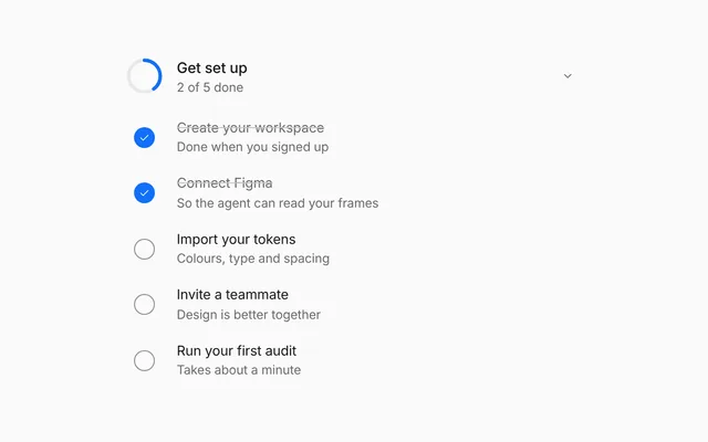
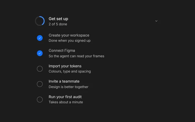
A multi-step setup with a progress track that fills as you go. Free and MIT licensed, as HTML or a typed React component, in two styles with light and dark mode.
Install
Add it to your project with the CLI.
HTML, CSS and JavaScript
npx designme add stepperReact
npx designme add stepper --reactThe CLI copies the source into your project, so you own it and can change anything. The HTML version lands in ./designme with the shared core and a demo.html. The React version lands in src/components/designme and needs React 19; it works in Next.js, Vite and Astro.
About
What it is for and what it does.
Stepper walks a person through a short setup one question at a time, with a track of numbered steps that fills in as they go. Each step offers a few choices, such as how much freedom the agent should have, or your own fields. Finishing shows a confirmation that sums up the picks, with a short burst of confetti.
- When setting up an agent needs a few decisions, like how it works and what it connects to
- When each question is simple enough to answer with one of a few options
- When people should be able to jump back to an earlier step to change an answer
- When a step needs a server check before the person can move on
- Each step shows a title, an optional description and either
optionsto pick from or your owncontent. - Continue slides the next step in from the right, and Back slides the previous one in from the left.
- Completed steps on the track show a check and can be clicked to go back to them.
onNextruns before moving on; returning false, or a promise of false, keeps the person on the step, and Continue is disabled while it is pending.- Finish calls
onFinishwith the picks, and the done screen lists the chosen options unless you setdoneDetail. The track is hidden there, and the screen keeps the height the steps had, with the confirmation centred in it. - Start over returns to the first step, and
bare(the default) sits flat in a chat thread.
- Options are a
radiogrouplabelled with the step title, and each option is aradiowitharia-checked. - The current step on the track has
aria-current="step". - Completed steps on the track are focusable buttons that respond to Enter and Space.
- The confetti is skipped when the user prefers reduced motion.
Usage
Import it and drive it from your own state.
Import
import { Stepper } from '@/components/designme/stepper/Stepper';Example
The demo above as a React component, 14 lines you can copy.
'use client';
// The preview from designme.dev, rebuilt from the React component: pick an option on each step, go back from the track, start over at the end.
import { Stepper, type StepperStep } from './Stepper';

const STEPS: StepperStep[] = [
  { label: 'Workspace', title: 'Name your workspace', description: 'This is what your team will see.', options: [{ label: 'Studio', detail: 'Small team' }, { label: 'Agency', detail: 'Many clients' }, { label: 'In-house', detail: 'One product' }] },
  { label: 'Agent', title: 'How should the agent work?', description: 'You can change this any time.', defaultOption: 1, options: [{ label: 'Ask first', detail: 'Safest' }, { label: 'Balanced', detail: 'Recommended' }, { label: 'Autopilot', detail: 'Fastest' }] },
  { label: 'Connect', title: 'Where do your designs live?', description: 'Pick one to start.', defaultOption: 2, options: [{ label: 'Figma', detail: 'Frames and tokens' }, { label: 'GitHub', detail: 'Code and PRs' }, { label: 'Both', detail: 'Full loop' }] }
];

export default function StepperDemo() {
  return <Stepper steps={STEPS} />;
}
Props
Everything Stepper takes.
| Prop | Type | What it does |
|---|---|---|
stepsrequired | StepperStep[] | |
step | number | The step on screen, from 0. steps.length shows the finished screen. Leave it out to let Back and Continue move it |
defaultStep | number | |
onStepChange | (step: number) => void | |
values | number[] | The picked option of each step, by index |
defaultValues | number[] | |
onValuesChange | (values: number[]) => void | |
onNext | (step: number, values: number[]) => boolean | void | Promise<boolean | void> | Called on Continue or Finish before moving on. Return false (or a promise of false) to stay on the step, for example to show an error |
onFinish | (values: number[]) => void | Called with the picks when the last step is finished |
doneTitle | string | The finished screen's heading, like "You're set up" |
doneDetail | ReactNode | The line under it. Defaults to the picked options, joined with dots |
backLabel | string | |
nextLabel | string | |
finishLabel | string | |
restartLabel | string | |
bare | boolean | Sits flat in a chat thread (the default, as on designme.dev). Set false to give it a card of its own |
className | string |
Code
The full source, as the CLI installs it.
Stepper.tsxReact · 159 lines
'use client';
import { useEffect, useLayoutEffect, useRef, useState, type KeyboardEvent, type ReactNode } from 'react';
import { cx } from '../lib/cx';
import { useControllable, useReducedMotion } from '../lib/hooks';
import { Icon } from '../lib/icons';
import { enter } from '../lib/motion';
import '../designme.css';
import './stepper.css';

export interface StepperOption {
  /** Like "Balanced" */
  label: string;
  /** The quiet line under it, like "Recommended" */
  detail?: string;
}

export interface StepperStep {
  /** The short name on the track, like "Agent" */
  label: string;
  /** The question at the top of the step, like "How should the agent work?" */
  title: string;
  /** The quiet line under the title */
  description?: string;
  /** The choices, one of which is picked. Leave them out and pass `content` for a step of your own */
  options?: StepperOption[];
  /** Your own fields for this step, shown under the title in place of the options */
  content?: ReactNode;
  /** The option picked to begin with. Defaults to the first */
  defaultOption?: number;
}

export interface StepperProps {
  steps: StepperStep[];
  /** The step on screen, from 0. steps.length shows the finished screen. Leave it out to let Back and Continue move it */
  step?: number;
  defaultStep?: number;
  onStepChange?: (step: number) => void;
  /** The picked option of each step, by index */
  values?: number[];
  defaultValues?: number[];
  onValuesChange?: (values: number[]) => void;
  /** Called on Continue or Finish before moving on. Return false (or a promise of false) to stay on the step, for example to show an error */
  onNext?: (step: number, values: number[]) => boolean | void | Promise<boolean | void>;
  /** Called with the picks when the last step is finished */
  onFinish?: (values: number[]) => void;
  /** The finished screen's heading, like "You're set up" */
  doneTitle?: string;
  /** The line under it. Defaults to the picked options, joined with dots */
  doneDetail?: ReactNode;
  backLabel?: string;
  nextLabel?: string;
  finishLabel?: string;
  restartLabel?: string;
  /** Sits flat in a chat thread (the default, as on designme.dev). Set false to give it a card of its own */
  bare?: boolean;
  className?: string;
}

/** A short burst of confetti from an element, in the accent and a few brand colours, falling as it fades. Returns its cleanup */
function burst(at: HTMLElement) {
  const bp = getComputedStyle(at).getPropertyValue('--dm-motion').trim() === 'bp';
  const box = document.createElement('span'); box.className = 'dm-stx-conf'; at.appendChild(box);
  const COL = ['var(--dm-accent)', 'var(--dm-ok)', 'var(--dm-c2)', 'var(--dm-c4)', 'var(--dm-c5)', 'var(--dm-c6)'], N = 22;
  for (let k = 0; k < N; k++) {
    const p = document.createElement('i'), round = k % 3 === 0, a = -Math.PI / 2 + (k / (N - 1) - .5) * Math.PI * 1.5 + Math.sin(k * 7.3) * .18;
    const d = 46 + (k * 37 % 30), w = round ? 5 : 3 + k % 2, h = round ? 5 : 7 + k % 3;
    if (round) p.className = 'dm-d';
    Object.assign(p.style, { width: w + 'px', height: h + 'px', marginLeft: -w / 2 + 'px', marginTop: -h / 2 + 'px', background: COL[k % COL.length] });
    box.appendChild(p);
    const x = Math.cos(a) * d, y = Math.sin(a) * d, r0 = k * 47 % 180, spin = (k % 2 ? 1 : -1) * (180 + k * 23 % 200), ms = (bp ? 760 : 1150) + k * 13 % 220;
    p.animate([
      { opacity: 1, transform: `translate(0,0) rotate(${r0}deg) scale(.6)` },
      { opacity: 1, transform: `translate(${x}px,${y}px) rotate(${r0 + spin * .5}deg) scale(1)`, offset: .42 },
      { opacity: 0, transform: `translate(${x * 1.18}px,${y + 46}px) rotate(${r0 + spin}deg) scale(.9)` }
    ], { duration: ms, delay: 120 + k % 4 * 18, easing: bp ? 'cubic-bezier(.65,0,.25,1)' : 'cubic-bezier(.16,1,.3,1)', fill: 'both' });
  }
  const t = setTimeout(() => box.remove(), 1700);
  return () => { clearTimeout(t); box.remove(); };
}

/** A few steps of setup, one question at a time, with a track that fills in as you go. */
export function Stepper({ steps, step, defaultStep = 0, onStepChange, values, defaultValues, onValuesChange, onNext, onFinish,
  doneTitle = "You're set up", doneDetail, backLabel = 'Back', nextLabel = 'Continue', finishLabel = 'Finish', restartLabel = 'Start over', bare = true, className }: StepperProps) {
  const [cur, setCur] = useControllable(step, defaultStep, onStepChange);
  const [picks, setPicks] = useControllable(values, defaultValues ?? steps.map(s => s.defaultOption ?? 0), onValuesChange);
  // each move slides the new step in from the side it comes from; the first step just appears
  const [seen, setSeen] = useState({ step: cur, dir: 0, key: 0 });
  if (seen.step !== cur) setSeen({ step: cur, dir: cur > seen.step ? 1 : -1, key: seen.key + 1 });
  const [busy, setBusy] = useState(false);
  const finished = cur >= steps.length;

  const next = async () => {
    if (finished) { setCur(0); return; }
    if (onNext) {
      setBusy(true);
      try { if ((await onNext(cur, picks)) === false) return; } finally { setBusy(false); }
    }
    if (cur === steps.length - 1) onFinish?.(picks);
    setCur(cur + 1);
  };
  const pick = (i: number, k: number) => setPicks(steps.map((_, j) => (j === i ? k : picks[j] ?? 0)));
  const s = steps[cur];
  // arriving at the finished screen from Finish is the moment to celebrate
  const celebrate = finished && seen.dir > 0;
  const ok = useRef<HTMLSpanElement>(null);
  const reduce = useReducedMotion();
  // the finished screen drops the track and keeps the height the steps had, centred in it
  const root = useRef<HTMLDivElement>(null), tall = useRef(0);
  useLayoutEffect(() => { if (!finished && root.current) tall.current = root.current.offsetHeight; });
  useEffect(() => { if (celebrate && !reduce && ok.current) return burst(ok.current); }, [celebrate, seen.key, reduce]);

  return (
    <div data-dm="" ref={root} className={cx('dm-stx', !bare && 'dm-panel', finished && 'dm-fin', finished && tall.current > 0 && 'dm-held', className)} style={finished && tall.current ? { minHeight: tall.current } : undefined}>
      <div className="dm-stx-track">
        {steps.map((st, i) => [
          // a finished step on the track takes you back to it
          <div key={'s' + i} className={cx('dm-stx-st', i === cur && 'dm-on', i < cur && 'dm-done')} aria-current={i === cur ? 'step' : undefined}
            {...(i < cur && { role: 'button', tabIndex: 0, onClick: () => setCur(i), onKeyDown: (e: KeyboardEvent) => { if (e.key === 'Enter' || e.key === ' ') { e.preventDefault(); setCur(i); } } })}>
            <span className="dm-n">{i < cur ? <Icon name="check" size="xs" /> : i + 1}</span><span className="dm-lb">{st.label}</span>
          </div>,
          i < steps.length - 1 && <div key={'l' + i} className={cx('dm-stx-ln', i < cur && 'dm-full')}><i /></div>
        ])}
      </div>
      <div className="dm-stx-vp">
        {/* each step slides in from the side it comes from; the finished screen stays put and celebrates instead */}
        <div key={seen.key} className={cx('dm-stx-body', !finished && seen.dir > 0 && 'dm-inr', !finished && seen.dir < 0 && 'dm-inl')}>
          {finished ? (
            <div className={cx('dm-stx-dn', celebrate && 'dm-go')}>
              <span ref={ok} className="dm-stx-ok">
                <svg viewBox="0 0 44 44" aria-hidden="true"><circle className="dm-c" cx="22" cy="22" r="20" /><path className="dm-k" d="M14 22.5l5.5 5.5L30.5 16.5" /></svg>
              </span>
              <b {...(celebrate ? enter(260) : {})}>{doneTitle}</b>
              <span {...(celebrate ? enter(340) : {})} className={cx('dm-muted', celebrate && enter(340).className)}>{doneDetail ?? steps.map((st, k) => st.options?.[picks[k] ?? 0]?.label).filter(Boolean).join(' · ')}</span>
            </div>
          ) : (
            <>
              <h4>{s.title}</h4>
              {s.description && <p>{s.description}</p>}
              {s.content ?? (s.options && (
                <div className="dm-stx-opts" role="radiogroup" aria-label={s.title}>
                  {s.options.map((o, k) => (
                    <button type="button" key={k} role="radio" aria-checked={picks[cur] === k} className={cx('dm-stx-o', picks[cur] === k && 'dm-on')} onClick={() => pick(cur, k)}>
                      <b style={{ fontWeight: 500 }}>{o.label}</b>{o.detail && <span>{o.detail}</span>}
                    </button>
                  ))}
                </div>
              ))}
            </>
          )}
        </div>
      </div>
      <div className="dm-stx-f">
        <button type="button" className="dm-pill dm-ghost dm-sm dm-stx-bk" disabled={cur === 0} onClick={() => setCur(Math.max(0, cur - 1))}>{backLabel}</button>
        <button type="button" className="dm-pill dm-primary dm-sm dm-stx-nx" disabled={busy} onClick={next}>{finished ? restartLabel : cur === steps.length - 1 ? finishLabel : nextLabel}</button>
      </div>
    </div>
  );
}
stepper.cssReact · 60 lines
/* Generated from designme.dev by scripts/sync.mjs. Edit the site, then sync. */
/* ---------- Stepper ---------- */
/* the agent walks you through setup in the chat: no container; with .panel it becomes a card */
.dm-stx{padding:var(--dm-s-4) 0;display:flex;flex-direction:column;gap:var(--dm-s-4)}
.dm-stx.dm-panel{padding:var(--dm-s-4)}
.dm-stx-track{display:flex;align-items:center;gap:0}
.dm-stx-st{display:flex;align-items:center;gap:var(--dm-s-2);font-size:12.5px;color:var(--dm-muted);white-space:nowrap;transition:color .3s}
.dm-stx-st .dm-n{width:24px;height:24px;border-radius:50%;display:grid;place-items:center;font-size:11.5px;font-weight:500;box-shadow:inset 0 0 0 1.5px color-mix(in srgb,var(--dm-line) 50%,transparent);color:var(--dm-muted);transition:background .35s var(--dm-ease),box-shadow .35s,color .35s;flex:none}
.dm-stx-st.dm-on{color:var(--dm-fg)}
.dm-stx-st.dm-on .dm-n{box-shadow:inset 0 0 0 1.5px var(--dm-accent-mark,var(--dm-accent)),0 0 0 4px var(--dm-accent-bg);color:var(--dm-accent-fg,var(--dm-accent))}
.dm-stx-st.dm-done{color:var(--dm-fg2);cursor:pointer}
.dm-stx-st.dm-done .dm-n{background:var(--dm-accent);box-shadow:none;color:var(--dm-on-accent)}
.dm-stx-ln{flex:1;height:2px;margin:0 10px;border-radius:1px;background:var(--dm-line);position:relative;overflow:hidden;min-width:16px}
.dm-stx-ln i{position:absolute;inset:0;background:var(--dm-accent-mark,var(--dm-accent));transform:scaleX(0);transform-origin:left;transition:transform .5s var(--dm-ease)}
.dm-stx-ln.dm-full i{transform:none}
@media (max-width:520px){.dm-stx-st .dm-lb{display:none}.dm-stx-st.dm-on .dm-lb{display:inline}}
/* each step sits in the middle, the same distance from the track above and the buttons below */
.dm-stx-vp{overflow-x:clip;overflow-y:visible;min-height:150px;display:flex;flex-direction:column;justify-content:center}
.dm-stx-body{display:flex;flex-direction:column;gap:10px}
.dm-stx-body.dm-inr{animation:dm-stxr .45s var(--dm-ease) both}.dm-stx-body.dm-inl{animation:dm-stxl .45s var(--dm-ease) both}
@keyframes dm-stxr{from{opacity:0;transform:translateX(24px);filter:blur(4px)}}
@keyframes dm-stxl{from{opacity:0;transform:translateX(-24px);filter:blur(4px)}}
.dm-stx-body h4{margin:0;font-size:14px;font-weight:500}
.dm-stx-body p{margin:0;font-size:12.5px;color:var(--dm-muted)}
.dm-stx-opts{display:grid;grid-template-columns:repeat(3,1fr);gap:var(--dm-s-2)}
@media (max-width:520px){.dm-stx-opts{grid-template-columns:1fr}}
.dm-stx-o{padding:var(--dm-s-3);border-radius:var(--dm-r-in);background:var(--dm-chip);text-align:left;font-size:13px;display:flex;flex-direction:column;gap:var(--dm-s-1);transition:background .2s,box-shadow .25s}
.dm-stx-o span{font-size:11.5px;color:var(--dm-muted)}
@media (hover:hover) and (pointer:fine){.dm-stx-o:hover{background:var(--dm-hover)}}
/* the options fill the sliding view, which would cut an outside ring: theirs is drawn inside */
.dm-stx-o:focus-visible{outline-offset:-2px}
/* the options are grey tiles with no edge; the picked one turns white with a dimmed grey edge */
.dm-stx-o.dm-on{background:var(--dm-surface);box-shadow:inset 0 0 0 1px color-mix(in srgb,var(--dm-pick-line) 50%,transparent),0 1px 2px rgba(0,0,0,.04)}
@media (hover:hover) and (pointer:fine){.dm-stx-o.dm-on:hover{background:var(--dm-surface);box-shadow:inset 0 0 0 1px color-mix(in srgb,var(--dm-pick-line) 50%,transparent),0 1px 2px rgba(0,0,0,.04)}}
.dm-stx-f{display:flex;justify-content:space-between}
/* once it's done there is nothing to go back to: Start over sits alone in the middle */
.dm-stx.dm-fin .dm-stx-f{justify-content:center}
.dm-stx.dm-fin .dm-stx-bk{display:none}
/* finished: the track has done its job, so only the success shows, centred in the height the steps had */
.dm-stx.dm-fin .dm-stx-track{display:none}
.dm-stx.dm-fin .dm-stx-vp{min-height:0}.dm-stx.dm-fin .dm-stx-dn{padding:0 0 var(--dm-s-2)}
.dm-stx-bk[disabled]{visibility:hidden}
.dm-stx-dn{display:flex;flex-direction:column;align-items:center;gap:6px;padding:18px 0;text-align:center;font-size:13px}
.dm-stx-dn>b{font-size:14px;font-weight:500}
/* finished: the check pops and draws itself, a soft ring spreads from it, and a little confetti bursts out once */
.dm-stx-ok{position:relative;width:44px;height:44px;margin-bottom:6px}
.dm-stx-ok svg{display:block;width:44px;height:44px;overflow:visible}
.dm-stx-ok .dm-c{fill:var(--dm-accent-mark,var(--dm-accent));transform-origin:center;transform-box:fill-box}
.dm-stx-ok .dm-k{fill:none;stroke:var(--dm-on-accent);stroke-width:3;stroke-linecap:round;stroke-linejoin:round;stroke-dasharray:24}
.dm-stx-ok::after{content:"";position:absolute;inset:0;border-radius:50%;pointer-events:none}
.dm-stx-dn.dm-go .dm-stx-ok .dm-c{animation:dm-stxpop .6s var(--dm-ease) both}
.dm-stx-dn.dm-go .dm-stx-ok .dm-k{animation:dm-stxdraw .42s var(--dm-ease) .26s both}
.dm-stx-dn.dm-go .dm-stx-ok::after{animation:dm-stxring 1.2s var(--dm-ease) .18s}
@keyframes dm-stxpop{from{transform:scale(.3);opacity:0}60%{transform:scale(1.08);opacity:1}to{transform:none;opacity:1}}
@keyframes dm-stxdraw{from{stroke-dashoffset:24}to{stroke-dashoffset:0}}
@keyframes dm-stxring{from{box-shadow:0 0 0 0 color-mix(in srgb,var(--dm-accent-mark,var(--dm-accent)) 40%,transparent)}to{box-shadow:0 0 0 20px color-mix(in srgb,var(--dm-accent-mark,var(--dm-accent)) 0%,transparent)}}
.dm-stx-conf{position:absolute;left:50%;top:50%;width:0;height:0;pointer-events:none}
.dm-stx-conf i{position:absolute;left:0;top:0;border-radius:2px;opacity:0}
.dm-stx-conf i.dm-d{border-radius:50%}
stepper.htmlHTML · 10 lines
<div class="card bare" data-c="stepper">
  <div class="stage-in">
    <div class="stx">
      <div class="stx-track"></div>
      <div class="stx-vp"><div class="stx-body"></div></div>
      <div class="stx-f"><button class="pill ghost sm stx-bk">Back</button><button class="pill primary sm stx-nx">Continue</button></div>
    </div>
  </div>
</div>
stepper.cssHTML · 59 lines
/* ---------- Stepper ---------- */
/* the agent walks you through setup in the chat: no container; with .panel it becomes a card */
.stx{padding:var(--s-4) 0;display:flex;flex-direction:column;gap:var(--s-4)}
.stx.panel{padding:var(--s-4)}
.stx-track{display:flex;align-items:center;gap:0}
.stx-st{display:flex;align-items:center;gap:var(--s-2);font-size:12.5px;color:var(--muted);white-space:nowrap;transition:color .3s}
.stx-st .n{width:24px;height:24px;border-radius:50%;display:grid;place-items:center;font-size:11.5px;font-weight:500;box-shadow:inset 0 0 0 1.5px color-mix(in srgb,var(--line) 50%,transparent);color:var(--muted);transition:background .35s var(--ease),box-shadow .35s,color .35s;flex:none}
.stx-st.on{color:var(--fg)}
.stx-st.on .n{box-shadow:inset 0 0 0 1.5px var(--accent-mark,var(--accent)),0 0 0 4px var(--accent-bg);color:var(--accent-fg,var(--accent))}
.stx-st.done{color:var(--fg2);cursor:pointer}
.stx-st.done .n{background:var(--accent);box-shadow:none;color:var(--on-accent)}
.stx-ln{flex:1;height:2px;margin:0 10px;border-radius:1px;background:var(--line);position:relative;overflow:hidden;min-width:16px}
.stx-ln i{position:absolute;inset:0;background:var(--accent-mark,var(--accent));transform:scaleX(0);transform-origin:left;transition:transform .5s var(--ease)}
.stx-ln.full i{transform:none}
@media (max-width:520px){.stx-st .lb{display:none}.stx-st.on .lb{display:inline}}
/* each step sits in the middle, the same distance from the track above and the buttons below */
.stx-vp{overflow-x:clip;overflow-y:visible;min-height:150px;display:flex;flex-direction:column;justify-content:center}
.stx-body{display:flex;flex-direction:column;gap:10px}
.stx-body.inr{animation:stxr .45s var(--ease) both}.stx-body.inl{animation:stxl .45s var(--ease) both}
@keyframes stxr{from{opacity:0;transform:translateX(24px);filter:blur(4px)}}
@keyframes stxl{from{opacity:0;transform:translateX(-24px);filter:blur(4px)}}
.stx-body h4{margin:0;font-size:14px;font-weight:500}
.stx-body p{margin:0;font-size:12.5px;color:var(--muted)}
.stx-opts{display:grid;grid-template-columns:repeat(3,1fr);gap:var(--s-2)}
@media (max-width:520px){.stx-opts{grid-template-columns:1fr}}
.stx-o{padding:var(--s-3);border-radius:var(--r-in);background:var(--chip);text-align:left;font-size:13px;display:flex;flex-direction:column;gap:var(--s-1);transition:background .2s,box-shadow .25s}
.stx-o span{font-size:11.5px;color:var(--muted)}
@media (hover:hover) and (pointer:fine){.stx-o:hover{background:var(--hover)}}
/* the options fill the sliding view, which would cut an outside ring: theirs is drawn inside */
.stx-o:focus-visible{outline-offset:-2px}
/* the options are grey tiles with no edge; the picked one turns white with a dimmed grey edge */
.stx-o.on{background:var(--surface);box-shadow:inset 0 0 0 1px color-mix(in srgb,var(--pick-line) 50%,transparent),0 1px 2px rgba(0,0,0,.04)}
@media (hover:hover) and (pointer:fine){.stx-o.on:hover{background:var(--surface);box-shadow:inset 0 0 0 1px color-mix(in srgb,var(--pick-line) 50%,transparent),0 1px 2px rgba(0,0,0,.04)}}
.stx-f{display:flex;justify-content:space-between}
/* once it's done there is nothing to go back to: Start over sits alone in the middle */
.stx.fin .stx-f{justify-content:center}
.stx.fin .stx-bk{display:none}
/* finished: the track has done its job, so only the success shows, centred in the height the steps had */
.stx.fin .stx-track{display:none}
.stx.fin .stx-vp{min-height:0}.stx.fin .stx-dn{padding:0 0 var(--s-2)}
.stx-bk[disabled]{visibility:hidden}
.stx-dn{display:flex;flex-direction:column;align-items:center;gap:6px;padding:18px 0;text-align:center;font-size:13px}
.stx-dn>b{font-size:14px;font-weight:500}
/* finished: the check pops and draws itself, a soft ring spreads from it, and a little confetti bursts out once */
.stx-ok{position:relative;width:44px;height:44px;margin-bottom:6px}
.stx-ok svg{display:block;width:44px;height:44px;overflow:visible}
.stx-ok .c{fill:var(--accent-mark,var(--accent));transform-origin:center;transform-box:fill-box}
.stx-ok .k{fill:none;stroke:var(--on-accent);stroke-width:3;stroke-linecap:round;stroke-linejoin:round;stroke-dasharray:24}
.stx-ok::after{content:"";position:absolute;inset:0;border-radius:50%;pointer-events:none}
.stx-dn.go .stx-ok .c{animation:stxpop .6s var(--ease) both}
.stx-dn.go .stx-ok .k{animation:stxdraw .42s var(--ease) .26s both}
.stx-dn.go .stx-ok::after{animation:stxring 1.2s var(--ease) .18s}
@keyframes stxpop{from{transform:scale(.3);opacity:0}60%{transform:scale(1.08);opacity:1}to{transform:none;opacity:1}}
@keyframes stxdraw{from{stroke-dashoffset:24}to{stroke-dashoffset:0}}
@keyframes stxring{from{box-shadow:0 0 0 0 color-mix(in srgb,var(--accent-mark,var(--accent)) 40%,transparent)}to{box-shadow:0 0 0 20px color-mix(in srgb,var(--accent-mark,var(--accent)) 0%,transparent)}}
.stx-conf{position:absolute;left:50%;top:50%;width:0;height:0;pointer-events:none}
.stx-conf i{position:absolute;left:0;top:0;border-radius:2px;opacity:0}
.stx-conf i.d{border-radius:50%}
stepper.jsHTML · 52 lines
DM.def('stepper', (r, c) => {
  const S = [
    ['Workspace','Name your workspace','This is what your team will see.',[['Studio','Small team'],['Agency','Many clients'],['In-house','One product']]],
    ['Agent','How should the agent work?','You can change this any time.',[['Ask first','Safest'],['Balanced','Recommended'],['Autopilot','Fastest']]],
    ['Connect','Where do your designs live?','Pick one to start.',[['Figma','Frames and tokens'],['GitHub','Code and PRs'],['Both','Full loop']]]
  ];
  const stx = $('.stx', r), track = $('.stx-track', r), body = $('.stx-body', r), bk = $('.stx-bk', r), nx = $('.stx-nx', r);
  let cur = 0, pick = [0, 1, 2];
  track.innerHTML = S.map((s, i) => `<div class="stx-st" data-i="${i}"><span class="n">${i + 1}</span><span class="lb">${s[0]}</span></div>` + (i < S.length - 1 ? '<div class="stx-ln"><i></i></div>' : '')).join('');
  const sts = $$('.stx-st', track), lns = $$('.stx-ln', track);
  function show(i, dir){
    cur = i; sts.forEach((s, j) => { s.classList.toggle('on', j === i); s.classList.toggle('done', j < i); $('.n', s).innerHTML = j < i ? I('check','xs') : j + 1; });
    lns.forEach((l, j) => l.classList.toggle('full', j < i));
    if (i >= S.length){
      if (!stx.classList.contains('fin')) hold(stx);
      body.innerHTML = `<div class="stx-dn"><span class="stx-ok"><svg viewBox="0 0 44 44" aria-hidden="true"><circle class="c" cx="22" cy="22" r="20"/><path class="k" d="M14 22.5l5.5 5.5L30.5 16.5"/></svg></span><b>You're set up</b><span class="muted">${S.map((s, k) => s[3][pick[k]][0]).join(' · ')}</span></div>`;
      bk.disabled = true; nx.textContent = 'Start over'; stx.classList.add('fin');
      // arriving here from Finish is the moment to celebrate; the screen itself doesn't slide
      if (dir > 0){ const dn = $('.stx-dn', body); dn.classList.add('go'); enter($('b', dn), 260); enter($('.muted', dn), 340); burst($('.stx-ok', dn)); }
      return;
    }
    else { if (stx.classList.contains('fin')){ stx.classList.remove('fin'); release(stx); } const s = S[i]; body.innerHTML = `<h4>${s[1]}</h4><p>${s[2]}</p><div class="stx-opts">${s[3].map((o, k) => `<button class="stx-o${pick[i] === k ? ' on' : ''}" data-k="${k}"><b style="font-weight:500">${o[0]}</b><span>${o[1]}</span></button>`).join('')}</div>`;
      $$('.stx-o', body).forEach(b => b.onclick = () => { pick[i] = +b.dataset.k; $$('.stx-o', body).forEach(x => x.classList.toggle('on', x === b)); });
      bk.disabled = i === 0; nx.textContent = i === S.length - 1 ? 'Finish' : 'Continue'; }
    if (dir){ body.classList.remove('inr','inl'); void body.offsetWidth; body.classList.add(dir > 0 ? 'inr' : 'inl'); }
  }
  // a short burst of confetti from the check, in the accent and a few brand colours, falling as it fades
  function burst(at){
    if (REDUCE) return;
    const bp = getComputedStyle(r).getPropertyValue('--motion').trim() === 'bp';
    const box = document.createElement('span'); box.className = 'stx-conf'; at.appendChild(box);
    const COL = ['var(--accent-mark,var(--accent))', 'var(--ok)', 'var(--c2)', 'var(--c4)', 'var(--c5)', 'var(--c6)'], N = 22;
    for (let k = 0; k < N; k++){
      const p = document.createElement('i'), round = k % 3 === 0, a = -Math.PI / 2 + (k / (N - 1) - .5) * Math.PI * 1.5 + Math.sin(k * 7.3) * .18;
      const d = 46 + (k * 37 % 30), w = round ? 5 : 3 + k % 2, h = round ? 5 : 7 + k % 3;
      p.className = round ? 'd' : ''; p.style.width = w + 'px'; p.style.height = h + 'px'; p.style.marginLeft = -w / 2 + 'px'; p.style.marginTop = -h / 2 + 'px'; p.style.background = COL[k % COL.length];
      box.appendChild(p);
      const x = Math.cos(a) * d, y = Math.sin(a) * d, r0 = k * 47 % 180, spin = (k % 2 ? 1 : -1) * (180 + k * 23 % 200), ms = (bp ? 760 : 1150) + k * 13 % 220;
      p.animate([
        { opacity:1, transform:`translate(0,0) rotate(${r0}deg) scale(.6)` },
        { opacity:1, transform:`translate(${x}px,${y}px) rotate(${r0 + spin * .5}deg) scale(1)`, offset:.42 },
        { opacity:0, transform:`translate(${x * 1.18}px,${y + 46}px) rotate(${r0 + spin}deg) scale(.9)` }
      ], { duration:ms, delay:120 + k % 4 * 18, easing:bp ? 'cubic-bezier(.65,0,.25,1)' : 'cubic-bezier(.16,1,.3,1)', fill:'both' });
    }
    c.later(1700, () => box.remove());
  }
  nx.onclick = () => cur >= S.length ? show(0, -1) : show(cur + 1, 1);
  bk.onclick = () => show(Math.max(0, cur - 1), -1);
  sts.forEach((s, i) => s.onclick = () => { if (i < cur) show(i, -1); });
  show(0);
});
Questions
What people ask about it.
- How do I validate a step before the person continues?
- Pass
onNext(step, values). Return false, or a promise that resolves to false, to stay on the step. Continue is disabled while the promise is pending. - Can a step have my own inputs instead of options?
- Yes. Give the step
contentwith your own fields and leave outoptions. The content shows under the title. - How are the answers given back to me?
valuesholds the picked option index for each step, andonFinishreceives the same array when the last step is finished. Each step starts on itsdefaultOption, or the first option.
More in Product
Pricing, onboarding, setup flows and spending limits for the rest of your product.